Roadmap cards need frequent, small updates: status changes, quick notes, assignee swaps. If the editor is slow or cluttered, updates don't happen — and the roadmap drifts out of date.
We've completely redesigned the task editor to make these updates faster and more intuitive.
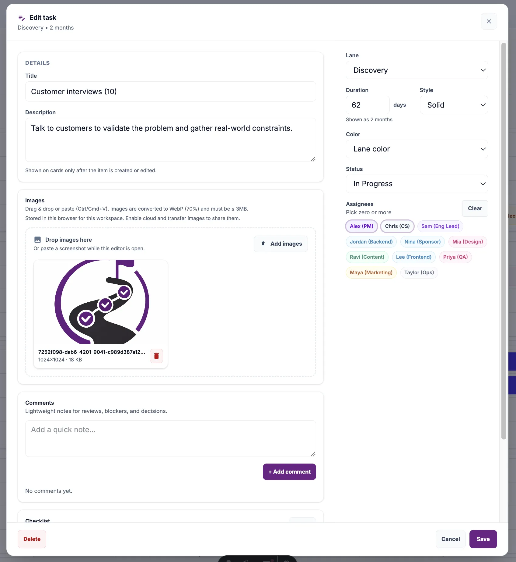
What's new
Clean two-column layout
Core task details (title, description, images, comments, checklist) on the left. Quick settings (lane, duration, status, assignees) on the right.
Visual assignee picker
Team members shown as color-coded pills. Click to assign, click again to unassign. No dropdowns, no searching.
Inline duration editing
Set task duration in days directly in the sidebar. The timeline shows a human-readable summary like "2 months" or "3 weeks".
Comments & images together
All task context lives in one scrollable area. Drag images, add comments, check off subtasks — without switching tabs or panels.
Design principles behind the change
Speed over completeness
Weekly roadmap updates shouldn't feel like filling out a form. The modal opens fast and focuses on the most common actions.
Context stays visible
Description, comments, and images scroll together. You never lose sight of what the task is while updating its status.
Keyboard-friendly
Tab through fields, Enter to save. Power users can update cards without touching the mouse.
Before vs. after
The old editor had all fields stacked vertically. Useful when you're creating a task from scratch, but awkward for the 95% of interactions that are small status tweaks.
The new layout acknowledges that most edits are incremental: change status, add a comment, update assignees. These actions are now one click away, without scrolling.
Try it yourself
Open any card in Timeline view. The new editor loads immediately. If you're updating roadmap status weekly (as most teams should), you'll feel the difference right away.